Edwin Fernandez
A redesign that
scaled across
three languages
Redesigning Dinamani — Tamil's oldest digital newsroom — for the digital era. The framework worked well enough that the parent group commissioned the same design system for their Malayalam and Kannada publications.
#1
Viewership in Tamilnadu
Client-reported, TNIE internal data
3
Languages Scaled
Tamil · Malayalam · Kannada
6 mo
Project Duration
Mobile & Web
01 — ABOUT DHINAMANI
A legacy brand stuck in a
digital stalemate
Dinamani is one of Tamil Nadu's most respected newspapers — part of The New Indian Express group, with over 90 years of journalistic heritage. Its digital portal carried that legacy, but not its relevance. By the time the redesign brief landed, Dinamani was watching audience share migrate to faster, digital-native Tamil news platforms.
The brief came from the parent group with real business stakes: retain print-loyal readers as they moved online, capture younger digital-first readers, and rebuild Dinamani as a viable digital property — not just a print brand with a website attached.
CLIENT
Dhinamani - TNIE Group
ROLE
Lead UX Designer
DURATION
6 Months
DOMAIN
Digital Publishing
BUSINESS RISK 01
Audience aging out
Print-loyal readers were aging, and the digital experience wasn't bringing the next generation in. A 90-year masthead was at risk of becoming a heritage asset rather than a working publication.
BUSINESS RISK 02
Ad revenue exposure
Cluttered ad placement was alienating readers without significantly improving inventory yield. The digital monetisation model needed to support readership, not fight it.
BUSINESS RISK 02
Group-wide implications
If Dinamani's digital strategy succeeded, the framework could extend to TNIE's other regional publications. If it failed, the group's broader digital transformation slowed with it.
Design reframe: This wasn't a visual refresh — it was a strategic redesign of a legacy publication for digital relevance, with a parent group watching to see if the framework could scale across their wider portfolio.
02 — THREE STAKEHOLDERS, THREE BRIEFS
Navigating competing
requirements.
The hardest design problem on Dinamani wasn't the screens. It was holding three legitimate but conflicting briefs in tension long enough to resolve them — without letting any one stakeholder dictate the whole design.
STAKEHOLDER 01 - EDITORIAL
Content-first reading experience.
The editorial team wanted readers focused on the journalism — long-form stories breathing, hierarchy guiding attention to substance over distraction.

STAKEHOLDER 02 - MARKETING
Ad inventory that actually performs.
Marketing needed monetizable surfaces — but the existing ad density was visibly harming the reading experience. The brief was to make ads work without making the page work against itself.

STAKEHOLDER 03 - TNIE BOARD
Brand consistency with the group.
The parent board wanted Dinamani recognisable as TNIE — visual signals that connected it to The New Indian Express family, where most of their reputation lived.
HOW I NAVIGATED IT
I treated the three briefs as a sequence, not a compromise. Editorial took priority on the reading surface — story hierarchy, typographic rhythm, content-first layouts. Marketing's ad inventory was redesigned to live between editorial blocks instead of inside them — preserving revenue surfaces without breaking the reading flow. Brand consistency lived at the system level — colour, masthead, and structural cues that connected Dinamani to TNIE without forcing visual sameness onto a Tamil-language reader's context. None of the three got everything they asked for; all three got the thing that mattered most to their function.
03 — FIVE PILLARS OF DISCOVERY
Grounding the redesign in
real reader behaviour.
No invented research methods. Discovery was structured around five concrete activities, with Google Analytics carrying the empirical weight — because we had real data on how 90 years of readers actually used the site.
01
Google Analytics
Behavioural patterns from Dinamani's own GA — reader segments, fold-depth, exit rates, time-of-day patterns.
02
Editorial Interviews
Direct conversations with newsroom editors to understand reader archetypes, content priorities, and ad constraints.
03
Heuristic Evaluation
Systematic audit of the existing site against Nielsen heuristics — surfacing usability and accessibility gaps.
04
Competitive Analysis
Feature gaps across leading Tamil dailies — what they did well, where Dinamani had structural room to differentiate.
05
Client Collaboration
Weekly working sessions with TNIE leadership to keep the redesign anchored in business priorities, not just craft.
READER AGE DISTRIBUTION
34.2%
18-24
24.8%
25-34
17.3%
35-44
11.1%
45-54
7.5%
55-54
5.1%
65+
Key analytics insights
45%
Users only reached the 4th fold — too many ads, not enough news above the fold.
54%
Drop from article mid-read. Consistent across all categories and topics.
68%
Just want latest news. Heatmaps showed heavy clicks on top navigation only.
63%
Male readership dominates. 36% female — a growth opportunity for the platform.
04 — PERSONAS
Three readers, three
distinct needs
Built from interview insights and analytics data — these personas guided every design decision throughout the project.
A
Avinash Paraiyar
52 · Business Owner · Chennai
GOALS
Reads news on-the-go and shares important articles with friends and family members.
FRUSTRATIONS
Excessive ads while reading on mobile. Missing regional editions on website.
READS
Dinamalar
News 18 Tamil
The Hindu
P
Preethi
30 · Data Scientist · Madurai
GOALS
In-depth news daily. Listens to audio articles while working from home in the evenings.
FRUSTRATIONS
Listen-feature unreliability. Ads disrupt long-form reading sessions.
READS
Dinamalar
News 18 Tamil
NY Times
P
Aaditya Raghavan
33 · PE Teacher · Vellore
GOALS
Latest sports news. Scans headlines quickly and reads selectively about cricket and IPL.
FRUSTRATIONS
No dedicated sports sub-categories. Navigation lacks granularity for sports topics.
READS
Dinamalar
News 18 Tamil
TOI Channel
METHOD, STATED PLAINLY
For a news portal with millions of anonymous readers, primary user interviews weren't a realistic research method. I won't pretend they were. These three segments were built from Dinamani's own Google Analytics behavioural data, validated against editorial domain knowledge, and used as decision-making frames throughout the project. Right-sized research for an anonymous-reader product is its own discipline.
05 — PROBLEMS → OPPORTUNITIES
Mapping pain into structure
Each problem identified in discovery was paired with a concrete design opportunity — not a vague aspiration. Six pairs governed every screen-level decision.
PROBLEM 01
OPPORTUNITY
45% of readers never scrolled past the first fold — the top of the page wasn't earning attention.
→ Redesign above-the-fold as the strongest editorial surface, with clearer story hierarchy and lighter ad density.
PROBLEM 02
OPPORTUNITY
54% mid-read drop-off on long-form articles — the reading experience was breaking down before payoff.
→ Reset typographic rhythm, ad placement, and progress affordances within long-form reading.
PROBLEM 03
OPPORTUNITY
68% mobile usage — but the existing mobile experience was a shrunken desktop, not a designed mobile surface.
→ Mobile-first design system, with desktop derived from it rather than the other way around.
PROBLEM 04
OPPORTUNITY
Ad density was hurting reading without significantly improving yield — the worst of both worlds.
→ Move ads between editorial blocks, preserving inventory surfaces while protecting reading flow.
PROBLEM 05
OPPORTUNITY
Three reader segments with conflicting needs — and no design that served any of them well.
→ Build a system flexible enough to serve Segment 01's depth, Segment 02's speed, and Segment 03's modernity.
PROBLEM 06
OPPORTUNITY
No design framework — every section was its own one-off, creating maintenance debt for the editorial team.
→ Build a composable design system: components that scale across sections, page types, and eventually other publications.
06 — THE SYSTEM THAT SCALED
One design framework. Three
languages.
The composable design system built for Dinamani became the framework's biggest validation. After Dinamani shipped, the TNIE group commissioned the similar framework for their Malayalam publication (Samakalika Malayalam) and their Kannada publication (Kannada Prabha) — three different scripts, three reading traditions, one underlying design architecture.
A client deciding to invest in your framework a second and third time is a stronger signal than any single-project metric. The system worked because it was built to scale — not because anyone planned for it to scale to two more languages on day one.
தினமணி
TAMIL · DINAMANI
The original redesign
Where the system was conceived, tested, and proven. 80+ screens across mobile, web, and tablet, governed by shared components and IA principles.
സമകാലിക
MALAYALAM · SAMAKALIKA MALAYALAM
First language scale-up
Same framework, adapted for Malayalam script density and reading patterns. The group's confidence in the system was the validation that mattered most.
ಕನ್ನಡ ಪ್ರಭ
KANNADA · KANDA PRABHA
Second language scale-up
A third language confirmed the architecture wasn't tied to Tamil — it was a publishing system that happened to start in Tamil.
METHOD, STATED PLAINLY
We have chosen Noto Sans for the entire projects. A Google font which provides clean, harmonious, and highly readable digital experience for the Tamil script.
Line height of 150% for headings, 160% for body copy for the Mobile App. It varied for the Website from 140% to 130% respectively. Though Malayalam and Kannada had a different line height due to the round character of the font.
SYSTEM PRINCIPLE 01
Composable, not bespoke
Every section was built from shared components — story cards, headline blocks, ad placements, navigation patterns. The same atoms recomposed for Home, Category, Detail, and Search.
SYSTEM PRINCIPLE 02
Script-aware, not script-locked
The system was designed assuming the script could change. Tamil's higher character density, Malayalam's curved character set, and Kannada's reading rhythm could each be accommodated without rebuilding components.
SYSTEM PRINCIPLE 03
Editorial-first, ad-respectful
Components were structured so editorial content sat in the visual foreground, with ad inventory living in dedicated between-block surfaces — never inside reading flow.
07 — COMPETITIVE ANALYSIS
Feature gaps across Tamil
dailies
Analysed direct and indirect competitors to identify differentiation opportunities — the question driving this exercise was "how can we push the boundaries?
A Comprehensive competitor study has been conducted to find the feature gaps, structure, advertisements and campaigns.
Features
Category Navigation
Mobile-Friendly Design
Search
Listen to Article
Dark Mode
Live Streaming
Personalization
District-wise News
Mobile App
Podcast/Audio
Stories
Short videos
Benhmarks
DAILY THANTHI
DINAMALAR
THE HINDU TAMIL
NEWS 18 TAMIL
MATHRUBHUMI
THE GUARDIAN
TIMES OF INDIA
MALAYALA MANORAMA
SOUTH CHINA MORNING POST
THE NEW YORK TIMES
08 — INFORMATION ARCHITECTURE & DESIGN
From research to
structured design
Robust IA for home and category pages translated seamlessly into precise wireframes. Inspired by South China Morning Post, The Guardian, The Times, and Mathrubhumi.
Redesigned Home Page IA
Reorganised 35+ sections into a streamlined hierarchy with strategic ad placement following Google best practices.
Navigation & Categories
Main News Carousel
Breaking News (Live)
Latest News Timeline
Bottom Navigation
District News
Web Stories
Popular Now
Special Articles
Video Section
Cinema & Sports
Editorial
Weekly Magazines
Noto Sans Tamil typography paired with a sophisticated dark greenish-blue palette selected from three colour options presented to the client.
Noto Sans Tamil
Dark Greenish-Blue Palette
Scrollable Category Tabs
Inline Ad Distribution
Dynamic Card Layouts
Timeline-based News
Audio Article Feature
Dark / Light Mode
Voice Search (Elderly)
Voice Search (Elderly)
WIREFRAME COVERAGE
80+ screens across all page type
CORE
Home Page
CORE
Article Detail
CORE
Category Pages
CORE
Search & Results
FEATURE
Live News
FEATURE
Web Stories
FEATURE
E-Paper
CORE
My City / District
SPECIAL
Astrology
SPECIAL
Election Hub
SPECIAL
IP/Sports Hub
SPECIAL
Treasury (30+ subs)
ONBOARDING
Splash & Login
ONBOARDING
Region & Topics
ONBOARDING
Subscription Plans
ONBOARDING
User Profile
07.1 — DESIGN
From legacy site to modern
publication.
Before
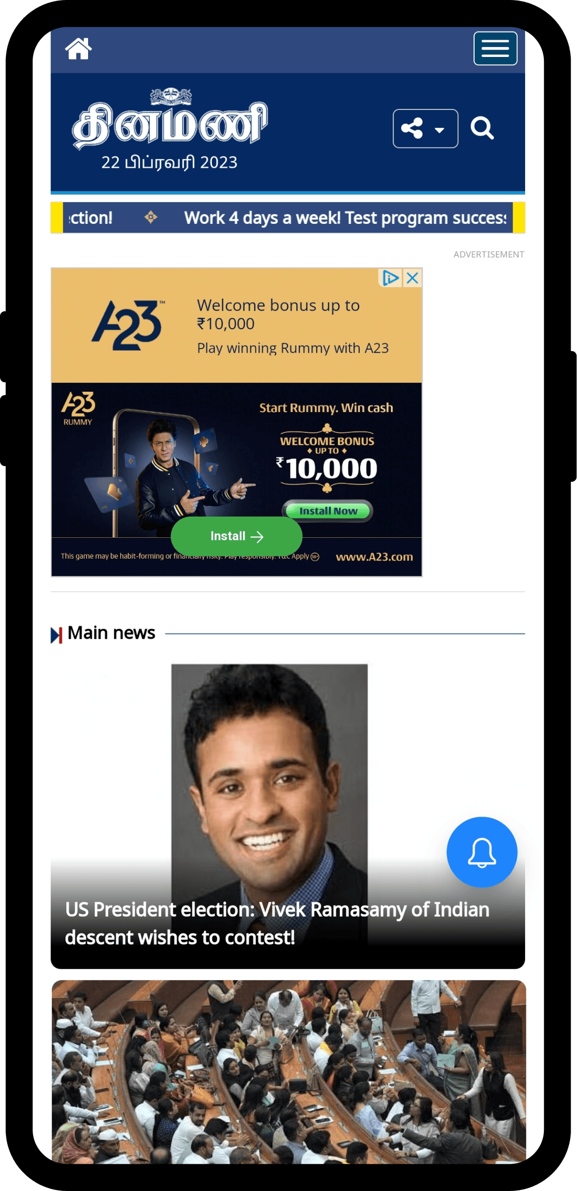
Before — cluttered, ad-heavy, weak editorial hierarchy
After

After — editorial-first reading surface, ads in dedicated
between-block placements
Home Page
Latest News

News Cards

My City

Article Page

News Report

Website

THE HEADLINE RESULT
#1
in Viewership Across Tamil Nadu
The strategic redesign proved transformative — driving exceptional growth in user engagement and reshaping Dinamani's market position entirely.
08 — THE REAL IMPACT
A redesign the client kept
investing in.
The strongest signal of a design's value isn't a single metric. It's a client deciding to bet more budget on the framework — twice.
#1
Most-visited Tamil news portal in
Tamil Nadu, 2024
80+
Screens designed across mobile app and responsive
web
6mo
End-to-end redesign from research to dev handoff
+2
Follow-on contracts won from this project's success
SPIN-OFF PROJECTS
Success that scaled acrosss the group
Samakalika Malayalam
Received contract to revamp and redesign this Malayalam daily — applying the same proven research-to-design methodology.
Kannada Prabha
Received contract to revamp and redesign this Kannada daily — extending the design system across languages.
09 — LEARNINGS
What this project confirmed
about how I design.
01
Build for the second use, not just the first
The biggest win on Dinamani wasn't its launch — it was the framework being commissioned again. Designing components to scale beyond their original context is what made that possible. Build assuming the second product is coming.
02
Anonymous readers need analytics-driven research
User interviews aren't the only legitimate research method. For an anonymous-reader product, GA behavioural segmentation is more honest and more useful than fabricated user studies. Right-sizing the research is part of the work.
03
Three stakeholders is a sequence, not a compromise
Editorial, Marketing, and the parent board all had legitimate but conflicting briefs. Treating them as a sequence — each getting the thing that mattered most to their function — beat trying to average them into one neutral design.
04
Script-aware design is system thinking
Designing assuming the script could change forced a level of structural separation that paid off when the framework scaled to Malayalam and Kannada. Constraints you design for upfront become flexibility you didn't have to negotiate later.
05
Research Builds Organizational Empathy
Using evidence-based insights to present design rationale to C-level stakeholders (CEO, MD, Director) transformed skepticism into advocacy.
06
Re-commissioning is the real metric
Any project can claim a launch number. Fewer can claim that the client decided to invest in the framework a second and third time. Re-commissioning is the strongest portfolio signal because it's the hardest to fake — and the most honest measure of a design's value.
Designed & built with care · Edwin Fernandes © 2026
Available for full-time roles