DINAMANI
NEWS PORTAL
website, repsonsive & mobiel app
A redesign that scaled across three languages
Redesigning Dinamani — Tamil's oldest digital newsroom — for the digital era. The framework worked well enough that the parent group commissioned the same design system for their Malayalam and Kannada publications. 2024

The context
THE BRIEF
Dinamani is one of Tamil Nadu's most respected newspapers — part of The New Indian Express group, with over 90 years of journalistic heritage. Its digital portal carried that legacy, but not its relevance. By the time the redesign brief landed, Dinamani was watching audience share migrate to faster, digital-native Tamil news platforms.
AUDIENCE Y AGING OUT
Print - loyal readers were aging, and the digital experce wasn't bringing the next generation in. A 90-year old mast head at risk of becoming a heritage asset rather than a working publication
AD Revenue exposure
Cluttered ad placement was alienating readers without significantly improving inventory yield. The digital monetisation model needed to support readership, not fight it.
GROUP WIDE IMPLICATION
If Dinamani's digital strategy succeeded. The framework could extend to TNIEs other regional publications. If it failed, the group's broader digital transformation slowed with it.
The one minute version
The Problem
The hardest design problem on Dinamani wasn't the screens. It was holding three legitimate but conflicting briefs in tension long enough to resolve them — without letting any one stakeholder dictate the whole design.
My role
Lead UX Designer, end to end. Research, Information architecture, Stakeholder management, Design decisions.
Led team of 2 UX and 1 UI designer.
Stakeholders
MD, CEO, Chief Editor, Editor, Editorial team, Marketing team, Publisher, Daily hunt editor.
Constraints
6 months, Multiple stake holders. Finding the right balance between editorial and marketing team. Building the vast information architecture
Outcome
Number 1 viewership in Tamilnadu
Client reported figured post launch
The method
Research -Google Anlaytics
Behavioural patter from Dinamani's own GA - reader segments, fold - depth, exit rates, time off day patterns.
Editorial Interviews
Direct and deep conversations with newsroom editors to understand archetypes, content priorities and ad constraints.
Heuristic Evaulation
Systematic audit of the existing site against Neilsen and f1Studioz heuristics. Surfacing Usability, feature and accessibility gaps.
Competitive Analysis
Feature gaps across leading Tamil dailies, Malayalam and regional dailies. International news papers like South China Morning Post, The Guardia, Times. What they did well, where Dinamani had structural room to differentiate
Stakeholder Collaboration
Weekly working sessions with TNIE leadership to keep the redesign anchored in business priorities, not just craft another UI excercise.
THE PROBLEM
Redesign while navigatin through competing requirements
The editorial team wanter readers focused on the journalism- long- form stories breathing, hierarchy guiding attention to substance over distraction. Marketing needed to monetize surfaces - but the existing ad density was visibly harming the reading experience. The brief was to mage ads work without making the page work against itselft


DECISIONS
The findings to decisions,
What i chose and what i ruled out
For a news portal with millions of anonymous readers, primary user interviews weren't a realistic research method. The three segments of users and personas were built from Dinamni's own Google Analytics behavioural data, validated against editorial domain knowledge, and used as a decision - making frames throughout the project. Right - sized research for an anonymous - reader product is its own discipline.
Findings
45% of readers never scrolled past the first fold - the top of the page wasn't earning attention.
68% mobile usage - but the existing mobile experience was a shrunken desktop wit tower ads of both side of the content.
54% mid - read drop - off on long for articles, the reading experience was breaking down before payoff
Ad density was hurting reading without significantly improving yield - the worst of both worlds.
Every section was its own one - off, creating maintenance debt for the editorial team.
Opportunity
Redesign the above fold as the strongest editorial surface, clearer story hierarchy and lighter ad density.
Mobile first design system, with desktop derived from it rather than the other way around.
Reset typographic rhythm, ad placement and progress affordances within long form reading.
Move ads between editorial blocks, preserving inventory surfaces while protecting reading flow.
Build a composable design system : components that scale across sections, page types and eventually other publications.
Features chosen
Category navigation
Listen to articles
Live streaming
Personalisation
District wise news
Podcast
Short videos + 8 more features
Scalable system
Every section was built for shared components
Story cards, headlines, ad placements, navigation patterns
The same atoms recomposed for Home, Category, Detail and Search
The same atoms recomposed for Home, Category, Detail and Search
Reduce dependability on Senior SREs
Reduce dependability on Senior SREs
Three different languages
Script aware, not script locked
The system designed assuming script could change
Tamils higher character density
Malayalam and Kannadas curved and round wide reading rhythm could each be accomodated
Samakalika Malayalam & Kannada Prabha followed the same structure
Editorial first as respectful
Components were structures so editorial content sat in the visual foregroung
Ad inventory living in dedicated between block surfaces.
Ads were kept not to intervene reading structure
Design
M site & Mobile App
Reorganised 35+ sections into a streamlines hierarchy with strategic ad placement following Google best practices. From legacy site ti modern publications
BEFORE
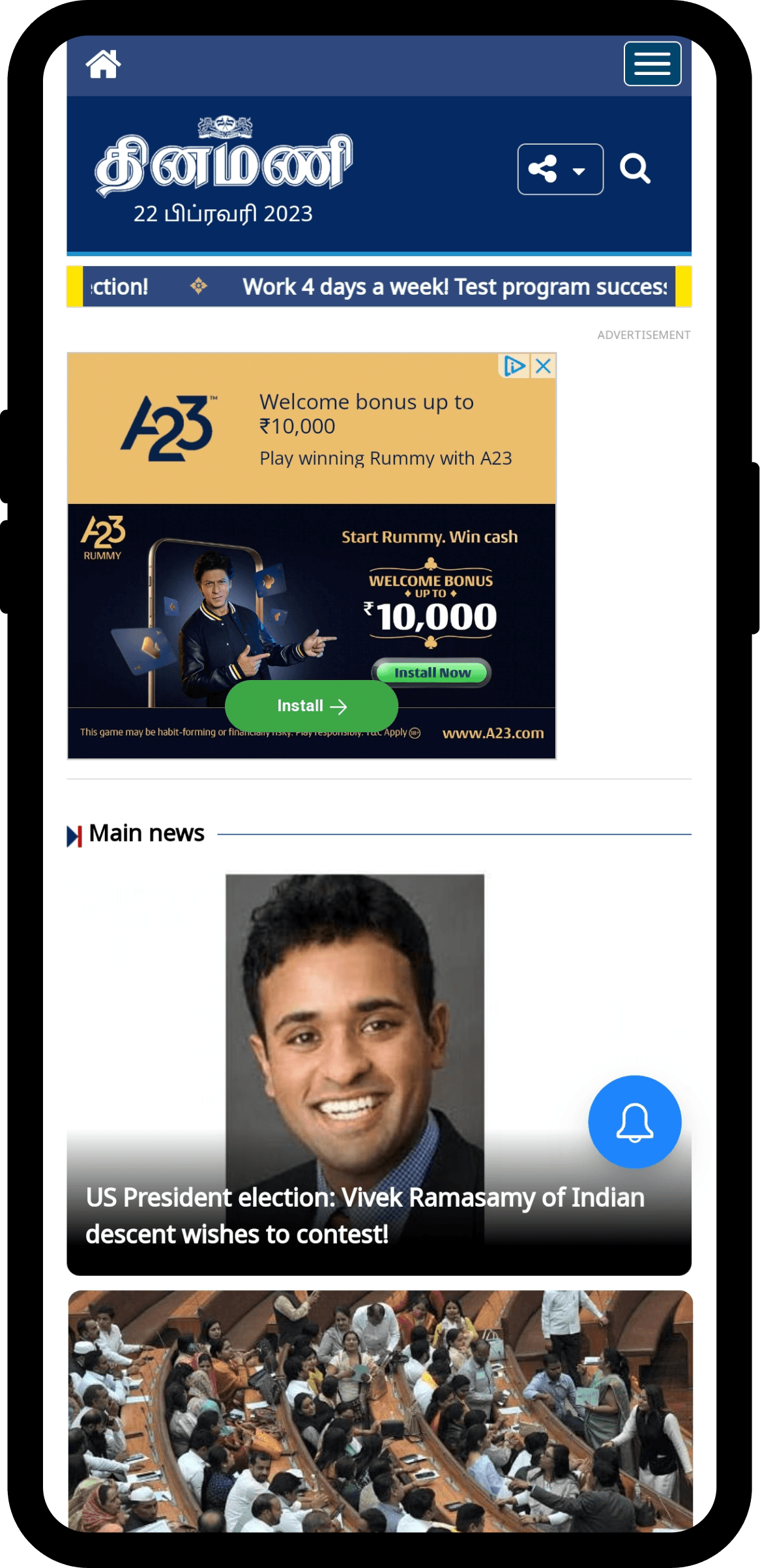
Cluttered, ad heavy and weal editorial hierarchy
AFTER
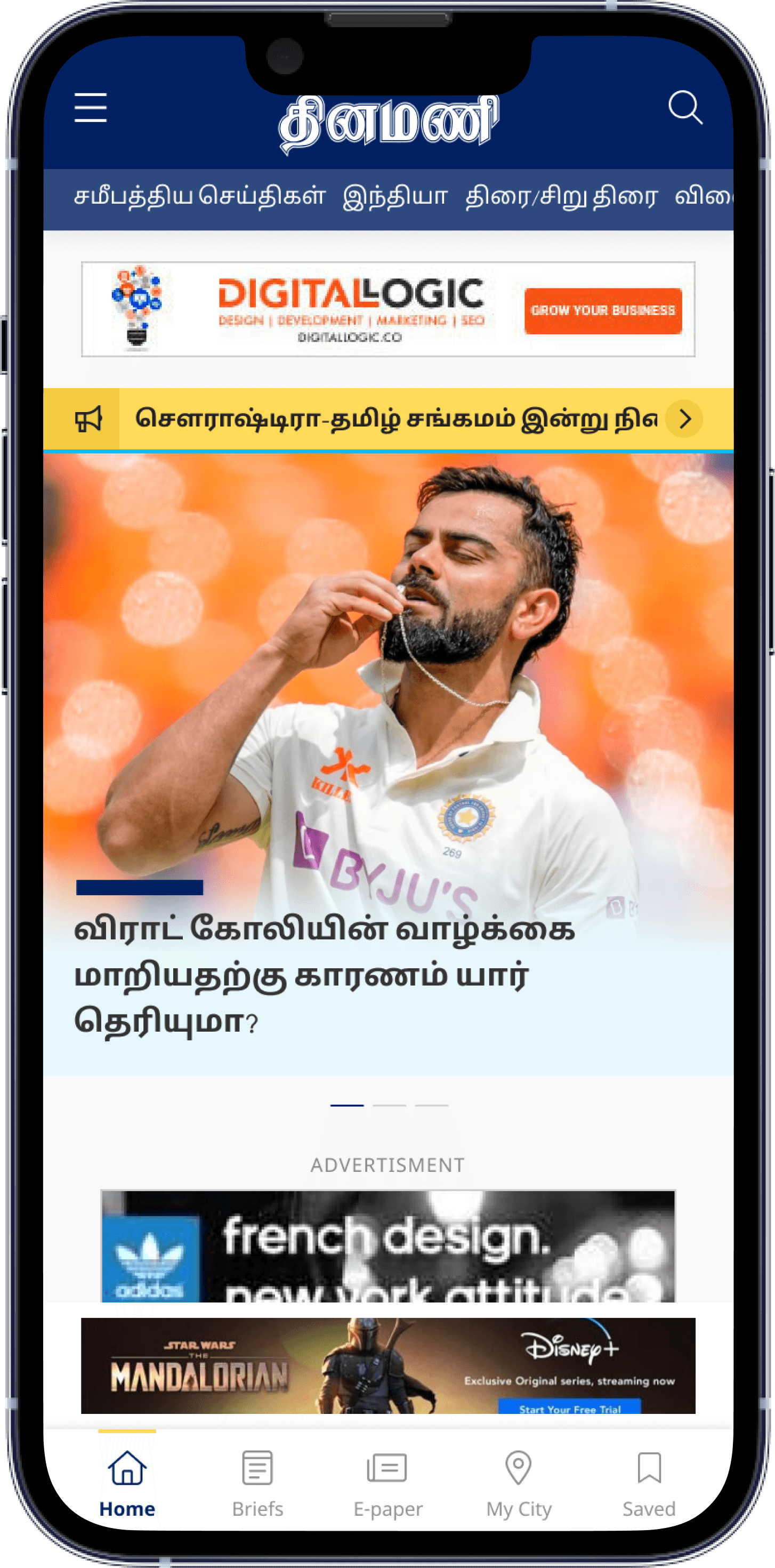
The home page. Editorial first reading surface, ads in dedicated between block placements
LATEST NEWS
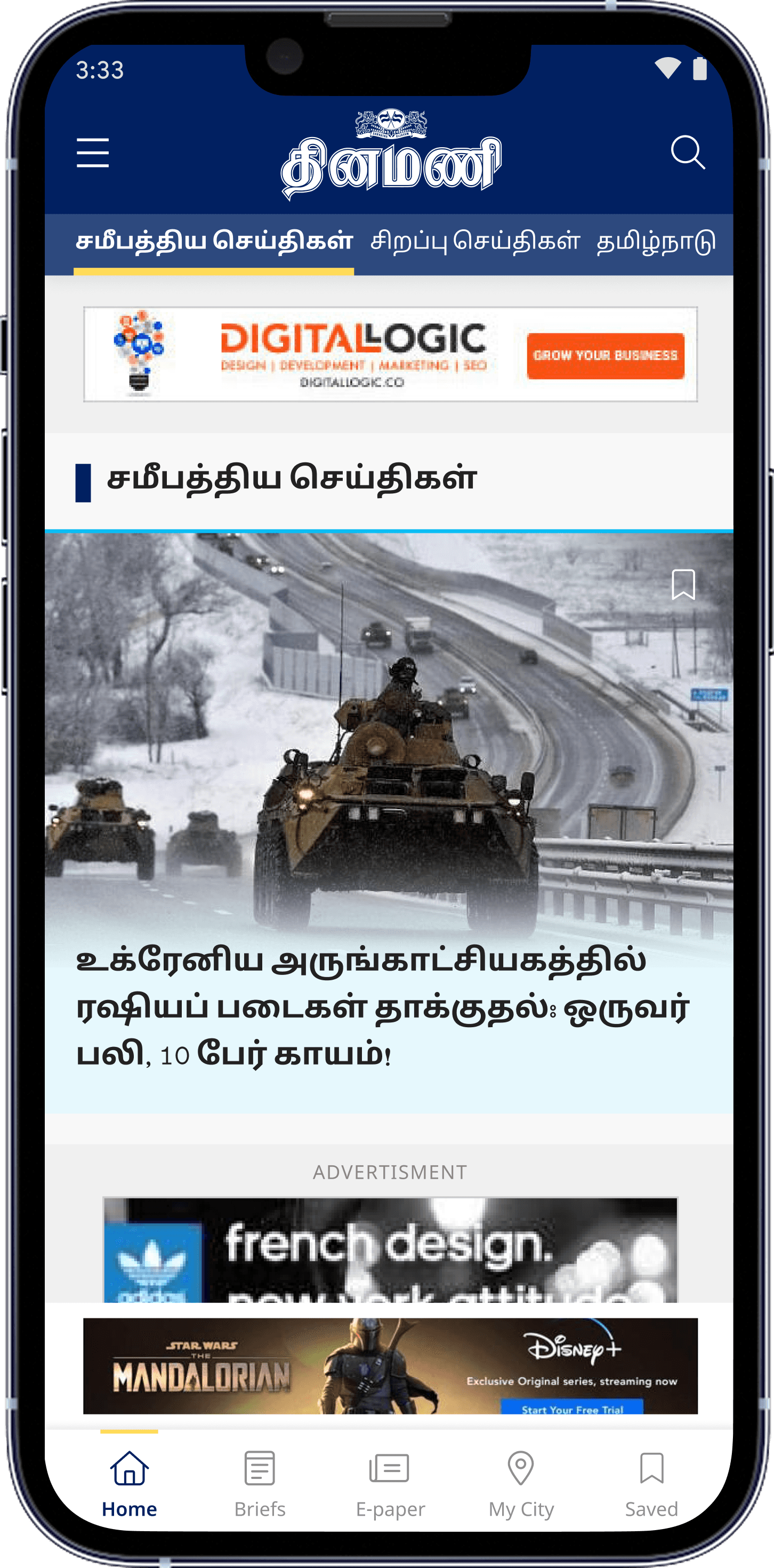
Easy to navigate from home page avoiding the scrolling.
NEWS CARDS
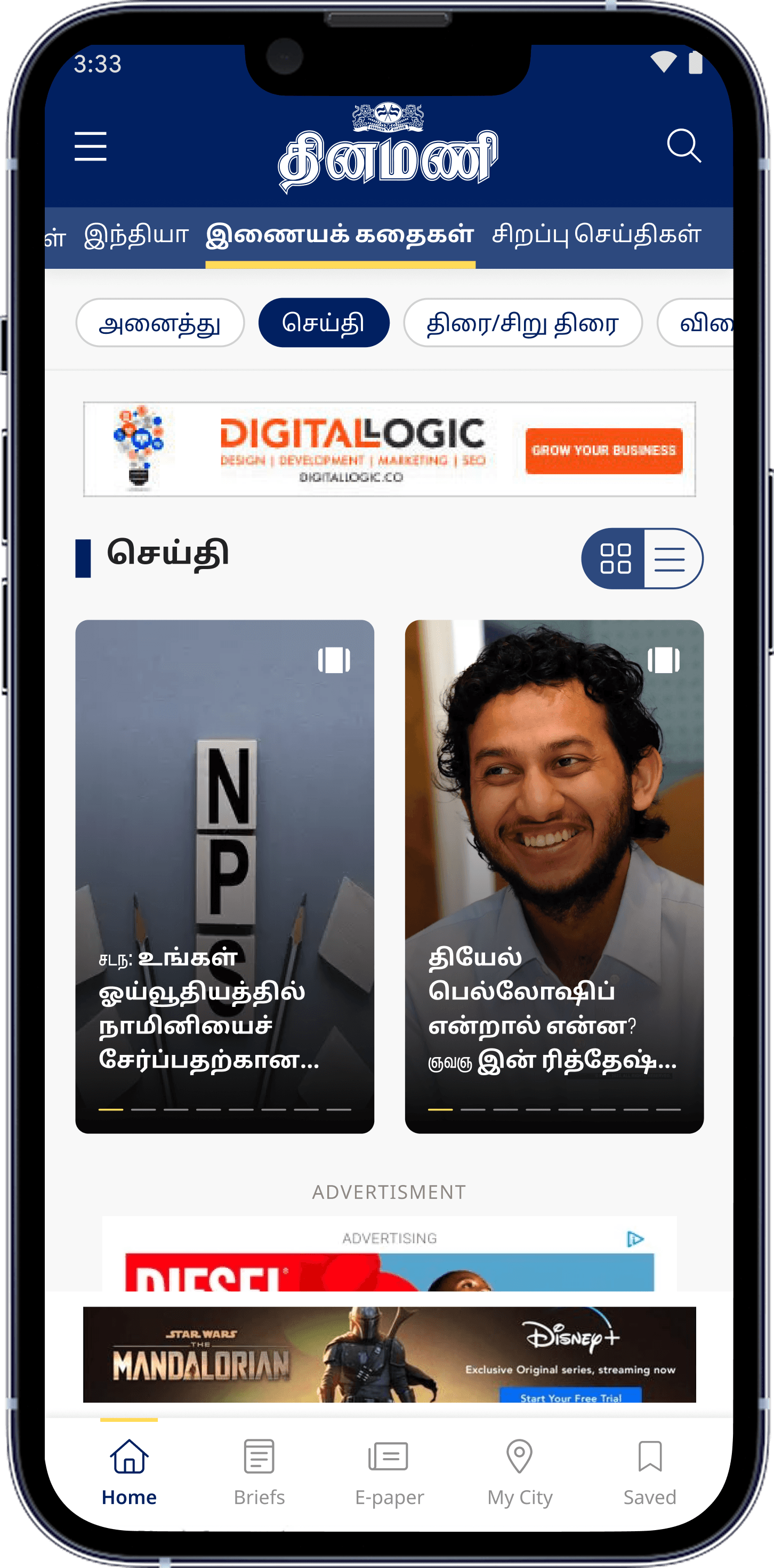
Inspired from inshots and fast horizontal scroll pattern observe form user interviews.
MY CITY
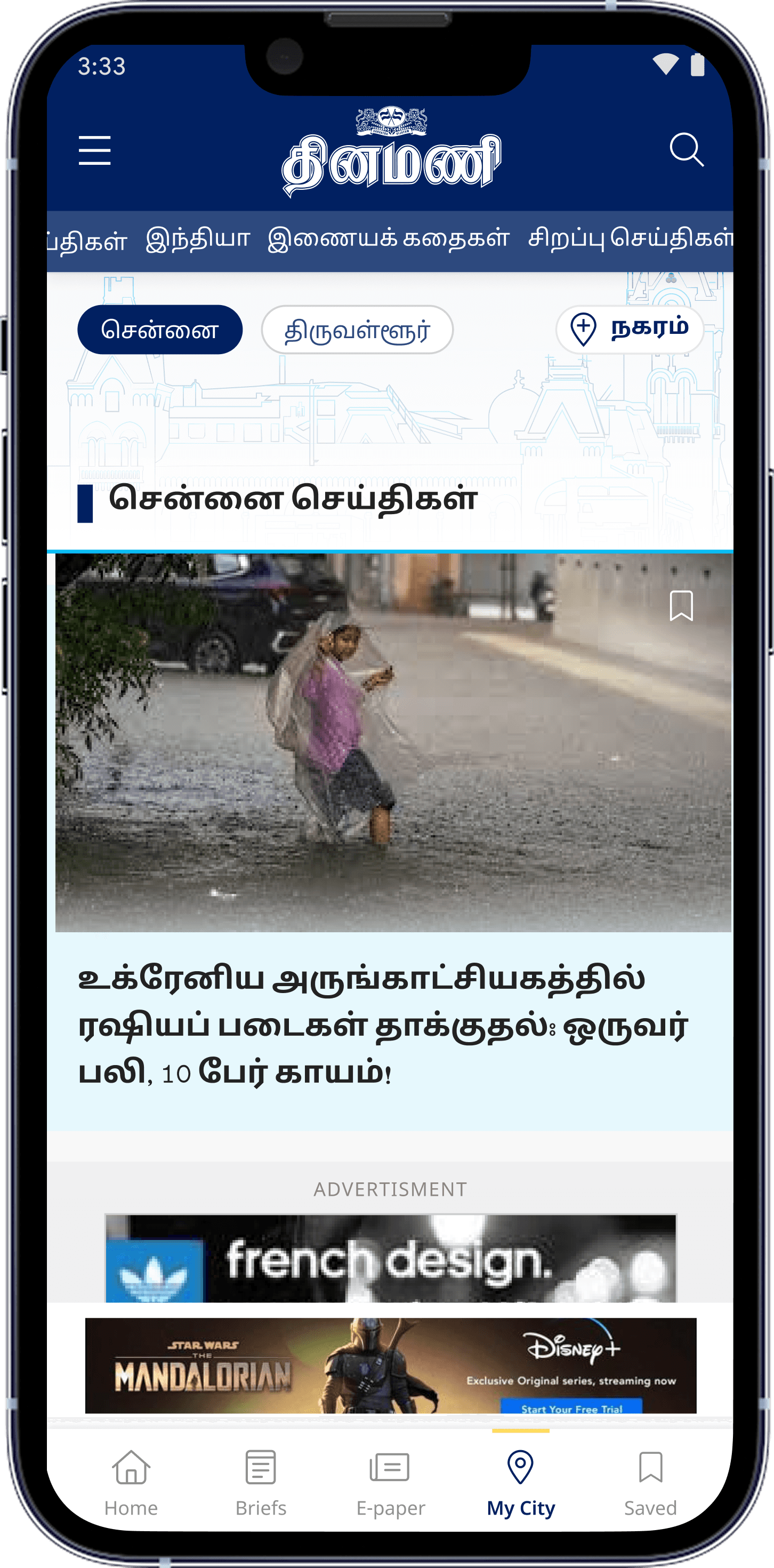
Flavour of city has been added with dedicated illustrations of iconic monuments
ARTICLE PAGE
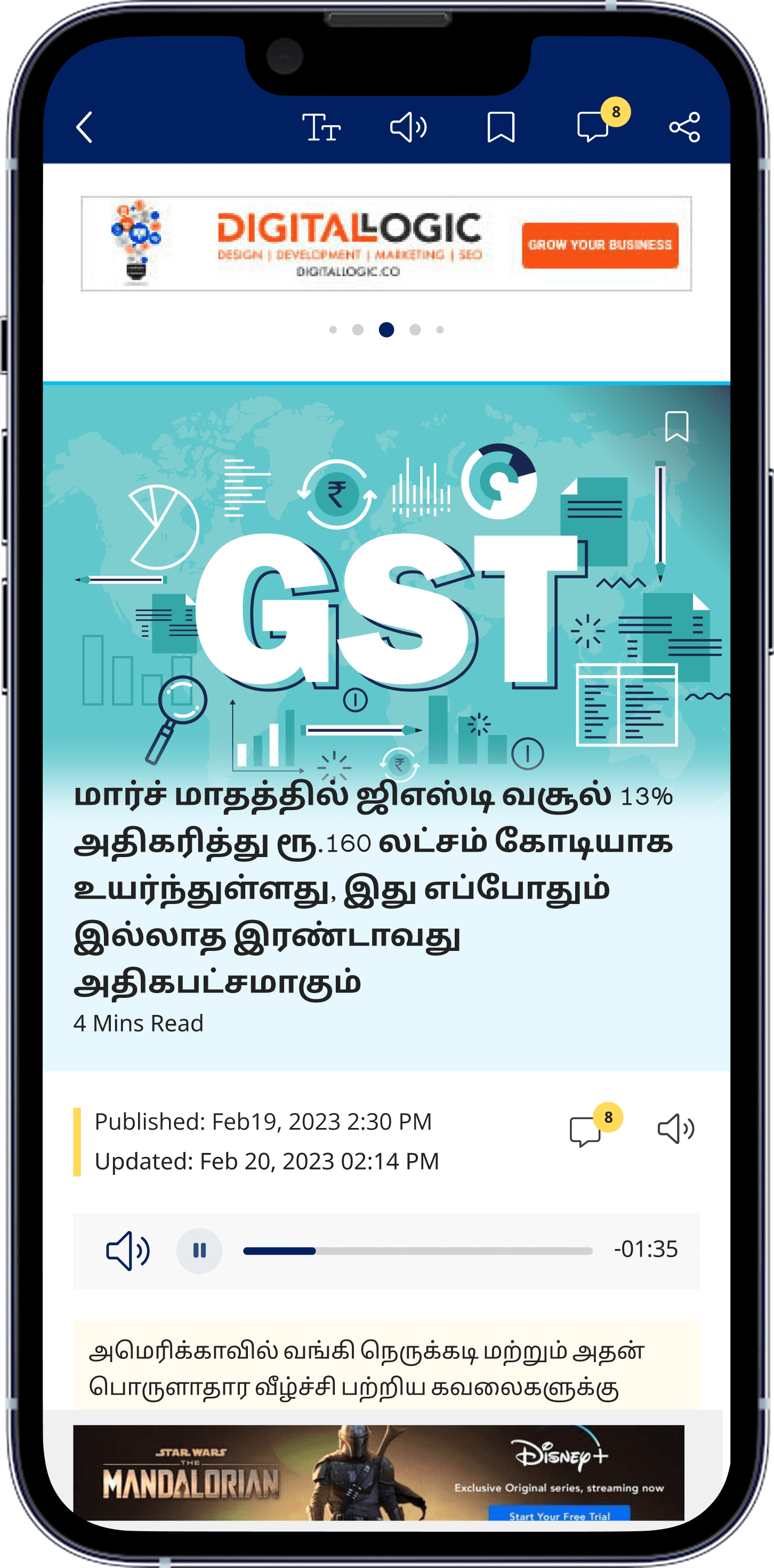
Inclusion of read option via audio. TO engage with article the comment section has been added as well.
NEWS REPORT
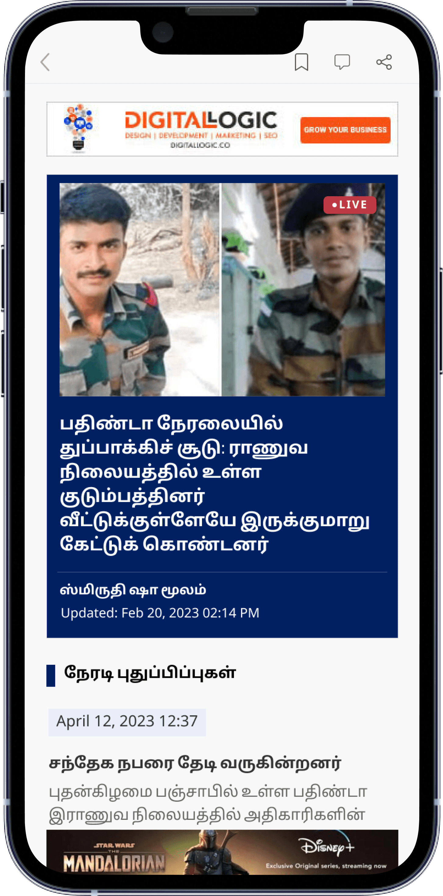
Flavour of city has been added with dedicated illustrations of iconic monuments
THE WEBSITE

The website has to offer a different visual perception for the brand. Existing category based approach of reading has been discarded, instead a more news and it's immediate relevance has been reflected through the redesign.
Measure, not estimated
#1
Most visited Tamil news portail in Tamil Nadu 2024, reported by the client
80+
Screens in total both mobile and website. One of the most in depth project taken care.
6 months
End to end redesign from research to development and hadoff
2 more
Follow on contracts won from this projects success. Samakalika Malayalam and Kannada prabha
Next case study
Oneinsure : Redefining the insurance portfolio
Designed & built with care · Edwin Fernandez © 2026
Available for full-time roles